Good design is like a refrigerator — when it works, no one notices, but when it doesn’t, it sure stinks.
– Irene Au
Visual identity is at the heart of most human interactions— it comes to mind when we think of certain people or places.
Those features and characteristics make our friends, family, and favorite celebrities recognizable, relatable, and memorable to us.
Your business’s visual identity functions the same way. Without strong visuals, people won’t value your brand or remember it when it matters.
You need distinctive qualities that set you apart from the competition if you want your products or services to be your potential customers’ first choice.
In this article, we’ll break down, step-by-step, how to create a strong visual identity for your brand that stands out and drives customers to your business.
What Is Visual Identity?
Visual Identity
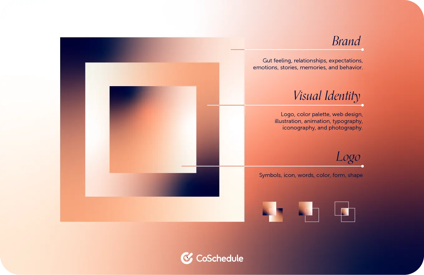
Visual identity refers to the elements used to represent a company, organization, or product, such as its logo, color scheme, web design, illustration style, animation style, typography, icons, photography, and the overall aesthetic representation of the brand.
These elements work together to create a unique and consistent visual representation that helps to communicate the identity and values of the organization and differentiate it from competitors.
Visual Identity Vs. Brand
Visual identity is a huge component of brand identity, but there are key differences between the two.
Visual identity has to do with the things people see when they interact with your brand and products. It’s the outward appearance of your brand.
Brand identity extends beyond visuals to cover everything that makes your brand come alive — voice, tone, story, values, persona, mission statement, value proposition, style guides, and more. It’s an expression of who your brand is on the inside.
If a company were a car, its visual identity would be the way the car looks — the color of the paint, the concaves and shape of the car, the size of the car, and even the interior trim. Brand identity is the way the car makes passengers feel, how the car drives, and the car’s reputation when it comes to safety.
Why Is Visual Identity Important?
Visual identity is essential because it helps to create a captivating and consistent visual representation of a brand that consumers can easily recognize.
A solid visual identity across all marketing and products can help to differentiate a brand from its competitors and create trust and credibility with consumers.
The Role Of Visual Identity In Building Trust,
Credibility, & Awareness
Your visual identity can either trigger a connection in the minds of prospective customers or make them wary of your brand and the quality of your products or services.
Here are some of the reasons why any business (big or small) that values brand perception should invest in cultivating a compelling visual identity:
- First impressions are essential for any brand — It only takes a split second for a customer to form an opinion about your brand. If they’re encountering your packaging, website, or app for the first time and it looks bland or poorly designed, they will assume you don’t put much thought into your business. And if they can’t trust what you’re offering, they won’t buy from you.
- It’s important to have a well-designed identity in an increasingly visual world — Every year, the demand for images and videos is increasing, so much so that the visual content market is expected to grow by $1.4 billion at a CAGR of 5.9% between 2022 and 2026. Marketing content is also becoming more visual than ever, and today, 51.4% of marketers incorporate visuals into 91-100% of their content. So, if you don’t have a cohesive and engaging visual identity that aligns with your brand’s personality, you’re going to get lost in the sea of competitors.
- Humans learn to associate visuals with meaning from birth — People engage more with visual content than any other type of external information. Having a purposeful visual identity that speaks to your audience’s needs will boost their affinity for your brand and allow them to absorb and retain your information better.
How To Create A Strong Visual Identity
You can’t just slap colors, fonts, images, and a logo together and consider your work done. You need to approach the process strategically to get the right results.
Here’s how:
Step 1: Understand How Your Brand Should Influence Your Visuals
For your visual identity to be effective, it must reflect what your brand does, who it is, what it cares about, and how you want to communicate this to your audience. This means you need to carefully think about and plan your brand purpose, personality, voice, tone, and messaging to ensure your visuals hit all the right notes.
It’s also important to clearly understand your audience’s needs, wants, and challenges. This will allow you to create impactful visual assets that resonate with the people you’re trying to reach.
Step 2: Consider The Basic Fundamentals Of Design
Although creating a visual identity is primarily a creative and artistic pursuit, there’s still some science to it. You have to adhere to certain fundamental principles if you want to design beautiful visuals that appeal to viewers.
The fundamentals of design that you need to consider include:
- Repetition — Used to create unity and evoke a sense of rhythm.
- Contrast — For creating emphasis and highlighting the difference between various elements.
- Hierarchy — Used to call attention to the importance of different elements and make viewers look at one over another.
- Balance/Balance using tension — For grouping weighted elements on a page symmetrically or asymmetrically.

Step 3: Define Your Color Palette
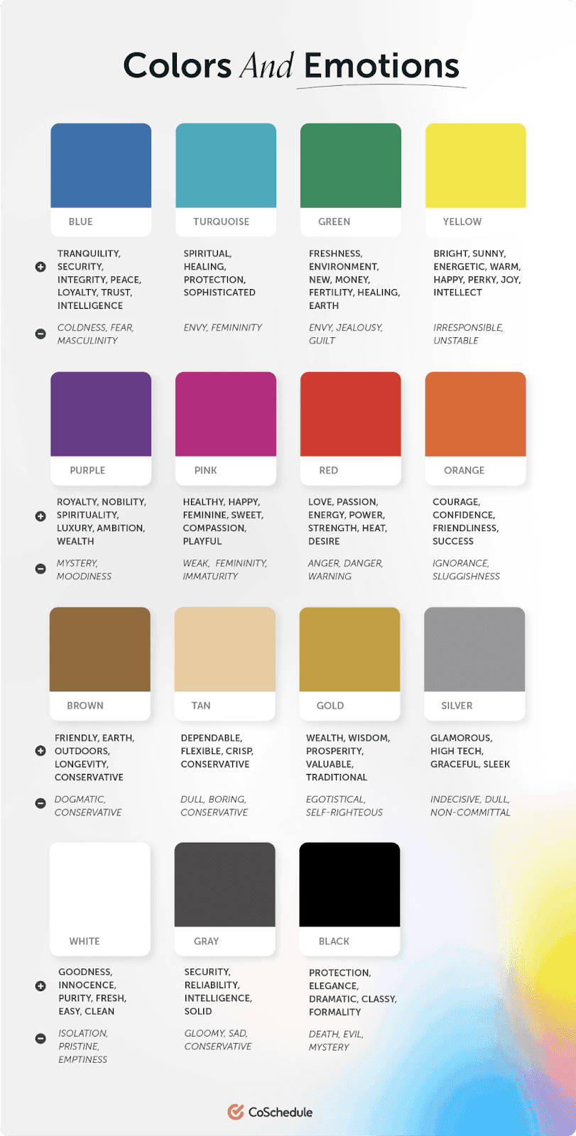
Different colors symbolize different things and invoke varied emotional responses when people see them.
Make sure you choose a color palette that embodies your company, your brand’s overall personality, and the message you want to send to your target audience. Learn more about the psychology of color.
Step 4: Create A Distinctive Logo That Reflects Your Brand
Your logo is the foundation of your brand’s visual identity. It’s one of the first things people will notice, so it needs to accurately communicate the personality and values that define your brand.
Your logo can be a symbol, icon, or even your brand name in a stylized format. According to expert designers, at a basic level, your logo should be unique, scalable, simple, and able to work well in monochrome.
Step 5: Choose Your Fonts
The font you choose should align with the aesthetic and tone of your brand. For example, a formal or traditional brand might choose a classic serif font, while a modern or tech-savvy brand might choose a sleek sans-serif font.
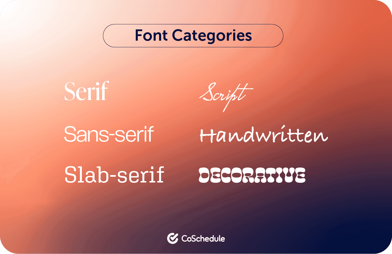
The main font categories you can draw from when designing your brand’s visual identity include:
- Serif
- Sans-serif
- Slab serif
- Script
- Handwritten
- Decorative
Step 6: Textures, Shapes, & Elements
Like colors, the textures, shapes, and visual elements you use in your design paint a specific picture in the minds of your audience, so you have to use them wisely.
For instance, using animations rather than regular images can add a fun and creative feel to your identity. Round shapes can trigger feelings of unity, love, and community.
On the other hand, shapes with sharp edges — like triangles, squares, and rectangles — can inspire a sense of trust and stability. But if you take them too far, they can make your brand seem aloof and impersonal.
Best Practices For A Strong Visual Identity
Here are a few tips you can implement to create a memorable and impactful visual experience for your customers:
Empower A Professional Designer To Shape Your Visual Identity
If you can afford it, bring in design professionals to do the heavy lifting for you. A trained designer will be proficient in using design to communicate your identity in a way that aligns with your brand’s values.
Brand designers specifically focus on the cohesive visual identity of a brand and the strategy behind it. They are experienced in creating visual brand systems from the ground up or rebranding and refreshing an already established system.
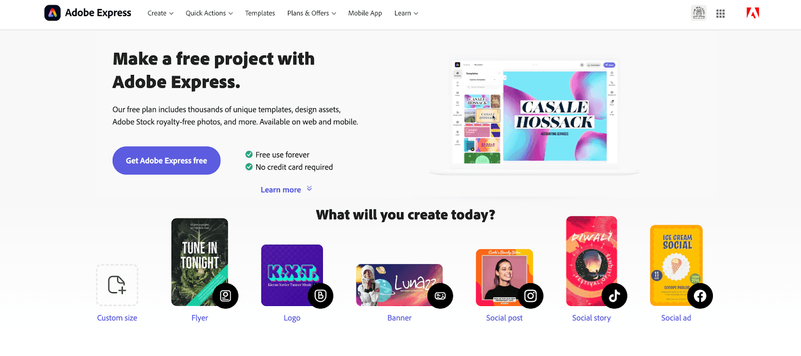
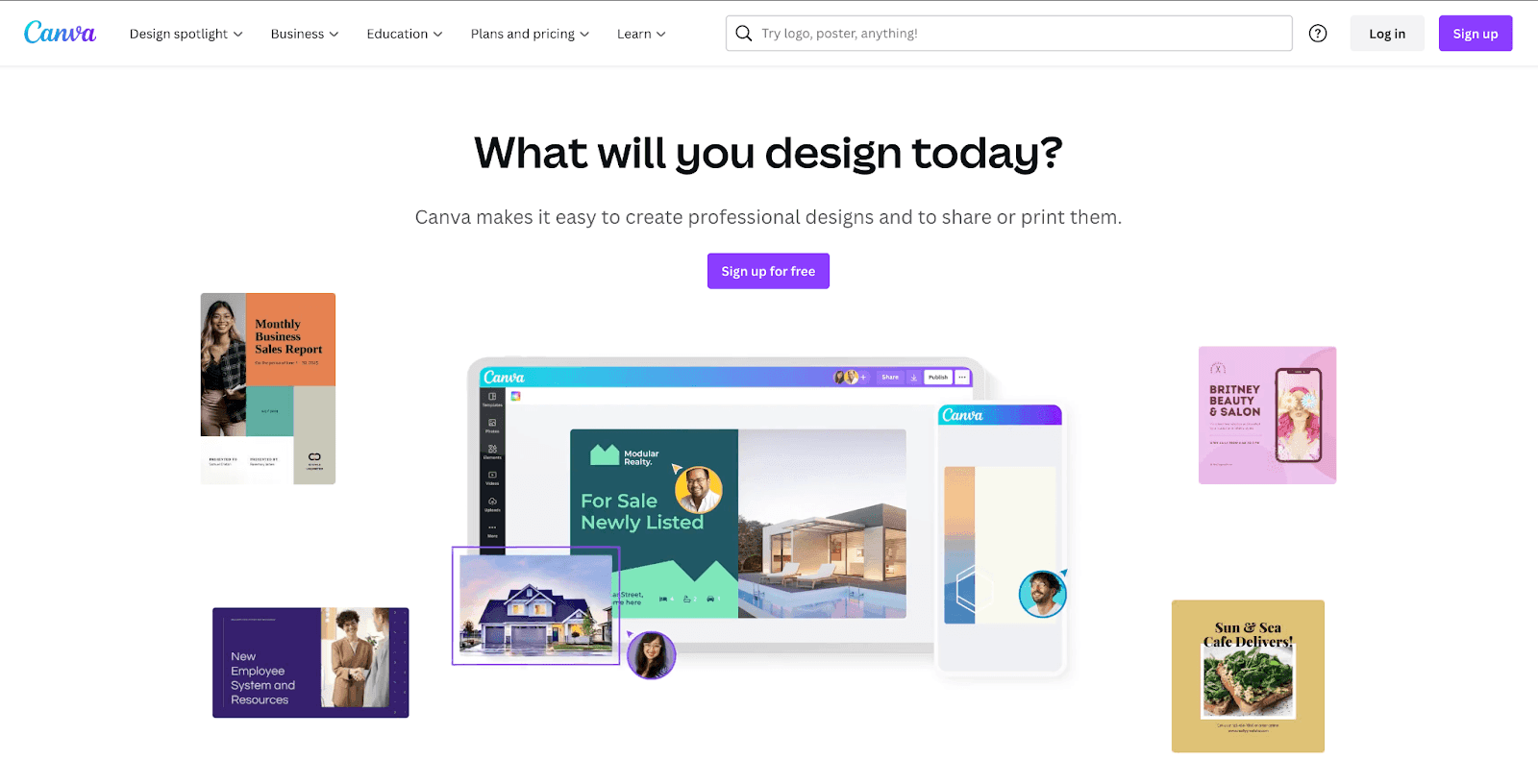
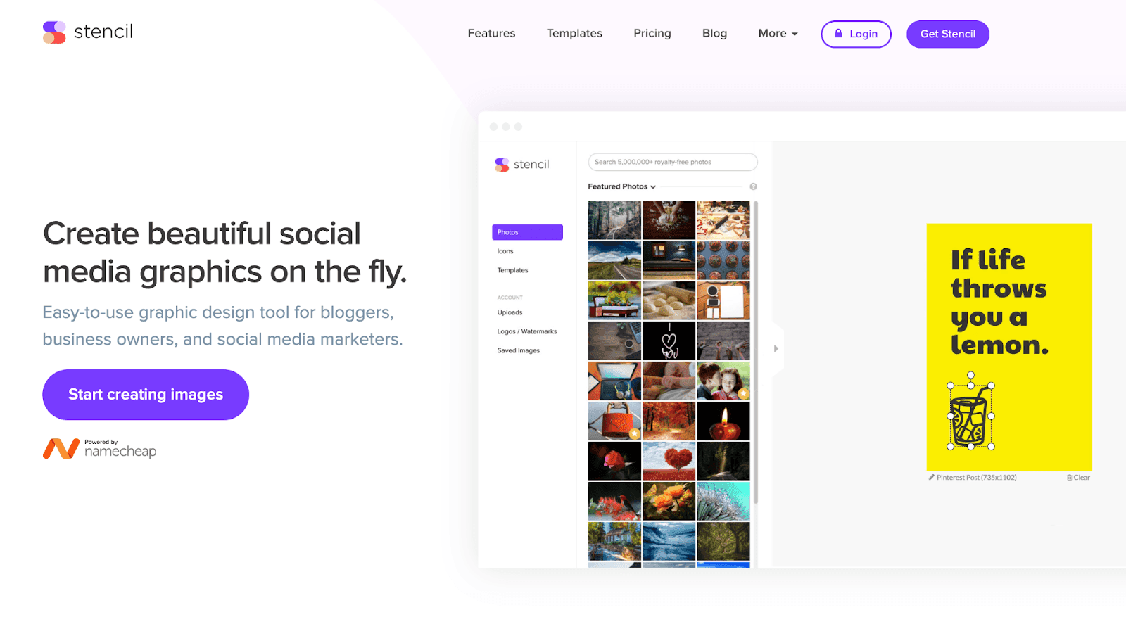
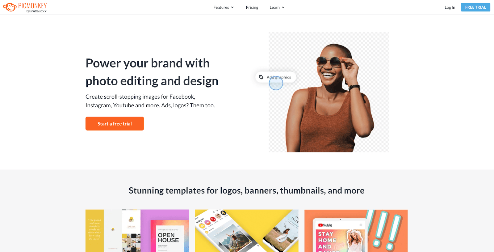
If you are unable to hire a professional, utilize design tools made for non-designers. These will generally have templates that incorporate the fundamentals of good design. Examples include:
- Adobe Express
- Canva
- Stencil
- PicMonkey
- Google Slides
Embrace Visuals To Communicate
Find ways to convey your message by using images in place of words. Your design and copy should work together as friends, and the more you can communicate visually, the quicker your customers will become interested in the value you’re providing.
Align Product Design With Visual Brand
If you’re selling a digital product, you should be keenly aware of how your product design aligns with the company’s visual brand. Your UX/UI designers should be on the same page as the brand designer who oversees visual design consistency.
How To Maintain A Consistent Visual Identity
You can’t wish a cohesive brand visual identity into existence. You have to take deliberate action to ensure that all your future designs align with your strategically crafted identity and give your audience the right impression.
Here’s how to build such a consistent identity:
Establish A Documented Visual Identity Guide
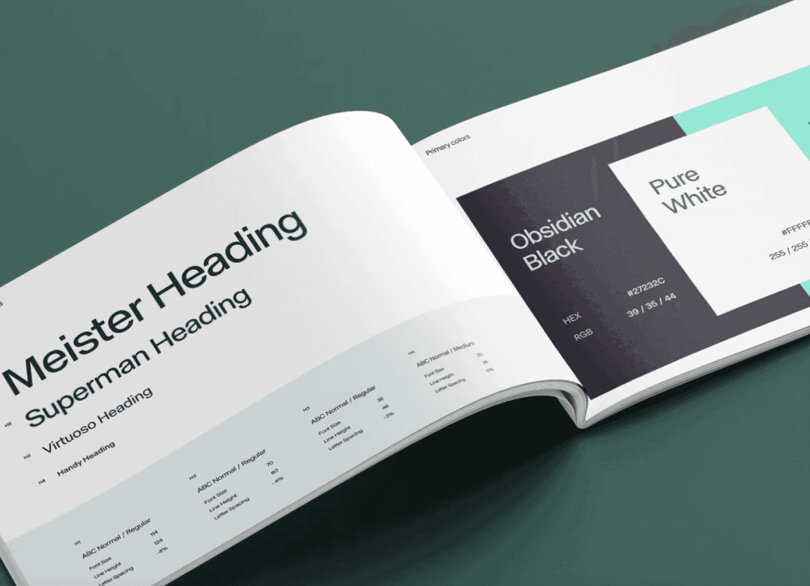
The key to maintaining brand standards and ensuring your visual identity remains consistent across the board and over time is to develop a style guide for all designers and teams to follow.
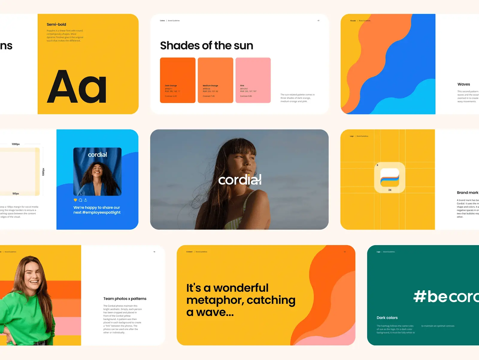
A style guide will help define how your team should use your logos, color palette, and brand font pairings. More detailed visual style guides will cover illustration styles, types of photography, icons, shapes and textures, patterns, and more strict typography standards.
Your visual style guide and brand guide should complement each other and be easily accessible to everyone on your team, from marketing to sales, design, and customer service.
Designate A Visual Identity Owner
Assign the task of managing your brand’s visual identity to a member of your team. This can be a designer at your company, a third-party expert in visual identity, or just someone with a good understanding of the way things should look.
The designer in this role should work closely with your marketing team to ensure the visual message you’re sending is consistent with company goals.
Create A Visual Identity Swipe File For Your Artists
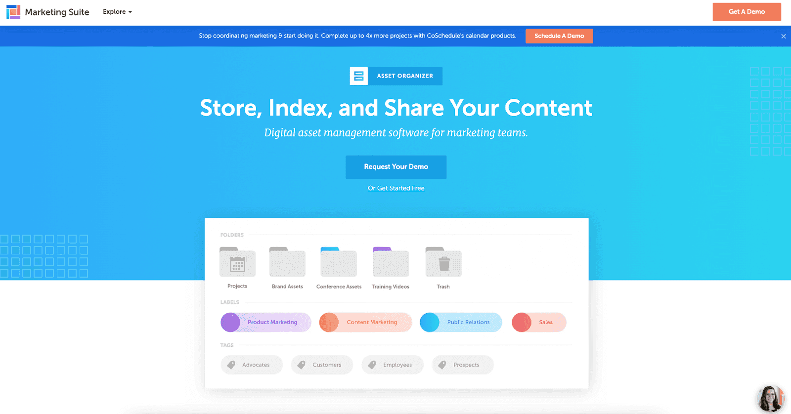
Put together a brand assets folder with graphics easily accessible to designers who create visual content for your brand.
You can organize and manage your visual identity assets easily using software like:
5 Examples Of Effective Visual Identity
Pay attention to visual trends to keep things fresh when (re)designing your brand’s visual representation.
Don’t just chase trends, but study new and emerging visual systems and use them as inspiration to create something unique to your brand.
Here are some examples of brands with strong visual identities that you can learn from.
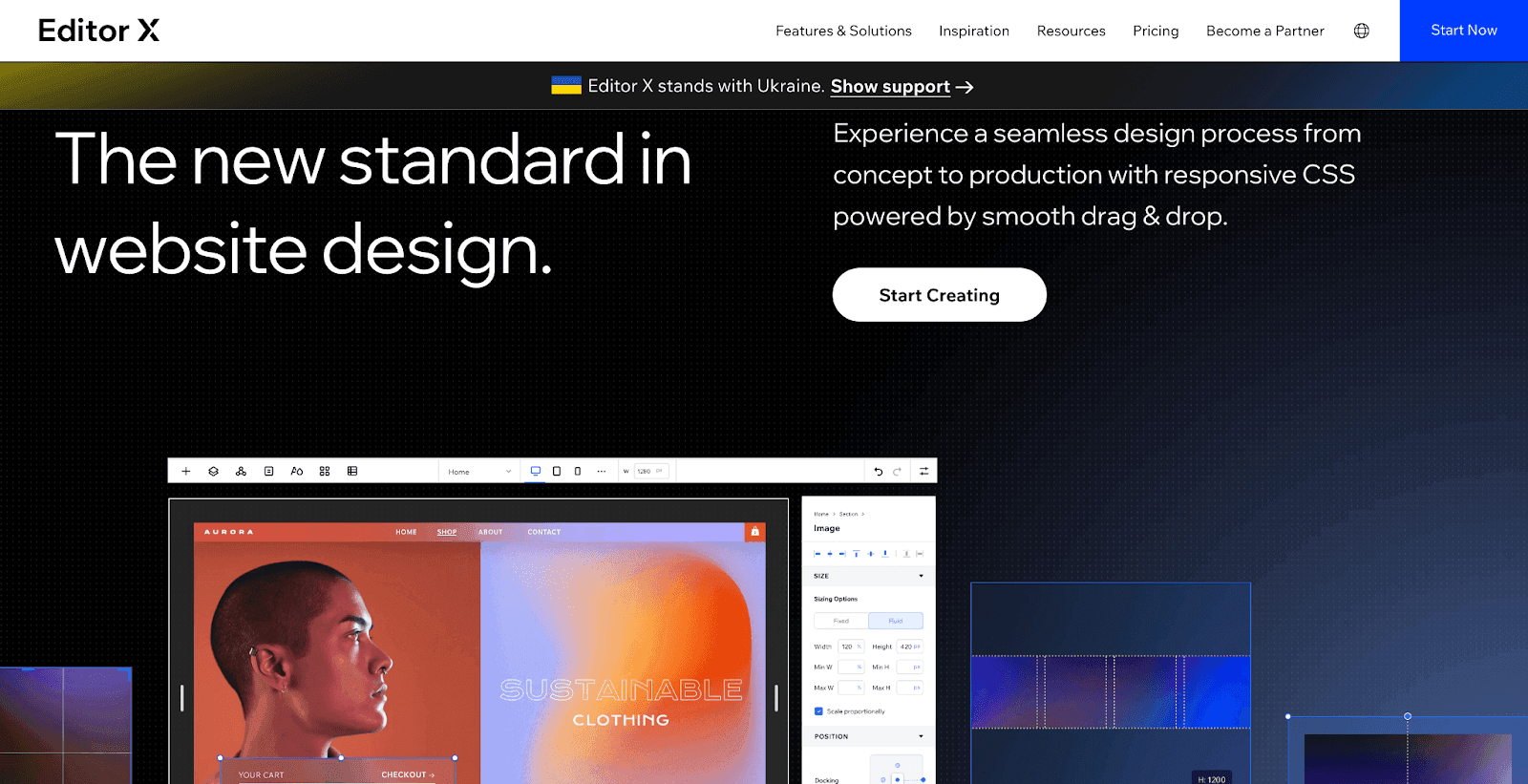
EditorX
As Editor X’s platform was built to help designers build and launch websites, it’s no surprise that the company’s visual identity delivers on every front. The brand uses black and white to create a professional and classy appearance, which it then tops off with gradients to emphasize the constantly evolving nature of design and the brand’s flexibility.
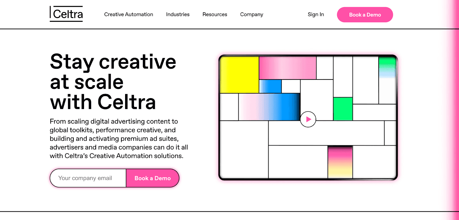
Celtra
Celtra’s reimagined visual identity is a blend of stunning imagery, vibrant colors, and gradients that come together to create a one-of-a-kind aesthetic that surprises and engages the audience while explaining its subject matter.
The unusual, versatile, and creative nature of Celtra’s visual style makes the brand instantly memorable and communicates its pioneering mentality in the creative technology space.
Mailchimp
Mailchimp’s revamped brand identity proves that you can express your brand’s creativity, artistry, energetic personality, and capacity for change while still creating a recognizable, memorable, and functional design.
Whether you’re scrolling through Mailchimp’s Instagram page, browsing the website, or taking the software for a spin, you’ll be wowed and comforted by the brand’s Cavendish yellow splashes and quirky design elements while learning about email marketing concepts.
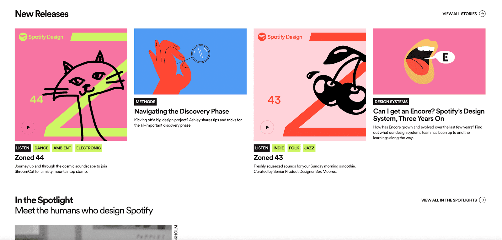
Spotify
Spotify has established itself as a household name in the world of music streaming. Its success results from many things, including Spotify’s vibrant and unmistakable visual identity.
Spotify’s use of bold colors combined with its stunning font and clever copy demonstrates the brand’s passion, playfulness, utility, and commitment to telling stories through music. The design invites audiences to not only engage with, but be a part of that story.
Humain

https://www.humain.ai/
Driven by a mission to help organizations oversee their digital evolution using AI, data, and automation, Humain takes a minimalist approach to its visual identity. Humain uses a conservative color blueprint, serif font, and clean lines to evoke a sense of innovation, possibility, and passion for using technology to drive change.
Conclusion
How you represent your brand and tell your story matters a great deal. The wrong perception can harm your credibility and limit your reach, sales, and retention potential.
If you want your brand to stand out, make a positive impression, and accurately communicate who you are and what you have to offer. Constructing a clear, consistent, and unique visual identity can make all the difference.


