Do you know what people do when they receive a flyer?
We can wager that it’s one of three things.
They …
- Immediately trash it.
- Look at it, feel disinterested in the information, and then trash it.
- View it, it strikes a chord with them, and they keep it to act on the flyer information.
You definitely don’t want to create a flyer design that receives either of the first two treatments from your audience.
Your goal is the third option after pouring a ton of time and resources into designing a flyer for promoting your product, service, or event.
Recommended: Event Name Generator
To help you achieve this, we’ve put together 31 flyer ideas to inspire your future flyers for your marketing campaigns.
1. Choose The Right Colors
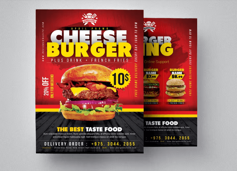
Colors offer powerful emotional cues that influence how your audience thinks and feels. Each color you pick should reinforce your message, from specific combinations to various shades, like green for health and yellow for optimism.
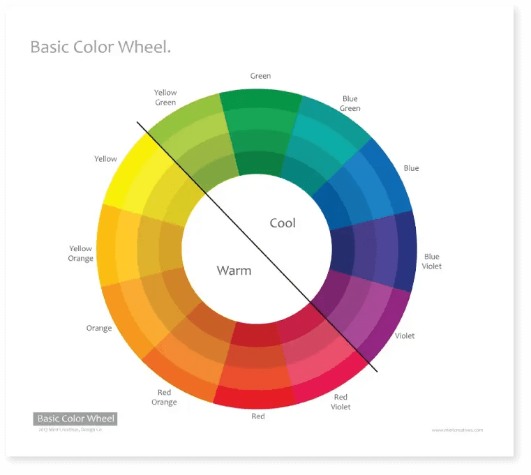
Typically, warm colors are eye-catching and evoke feelings of happiness and vivid energy, while cool colors are soothing.
2. Grab Attention With Imagery
According to MIT neuroscientists, the human brain can process images and retain that information within 13 milliseconds—at least 10X faster than the blink of an eye.
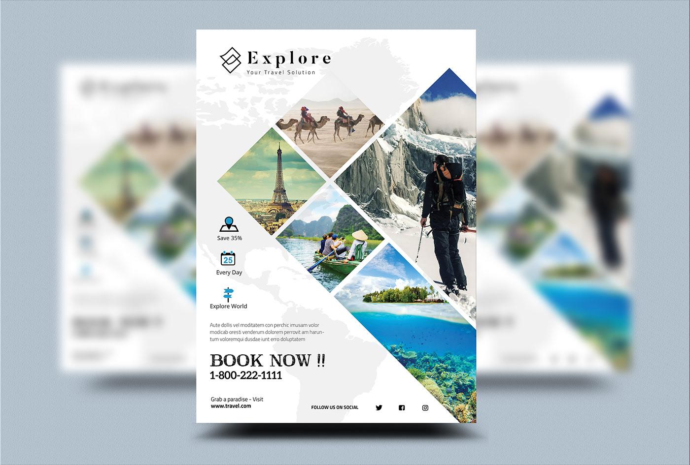
Therefore, you should find and use images in your flyer design to draw attention and make your flyers more memorable.
3. Add Icons For A Clean Design
Blocks of text in a flyer could lead to poor readability. When designing a readable flyer, use icons to represent functionality, ideas, or objects such as contact, hands, or store.
You can even create a cleaner flyer design that’s easily digestible by pairing icons with images.
4. Include Your Brand Logo
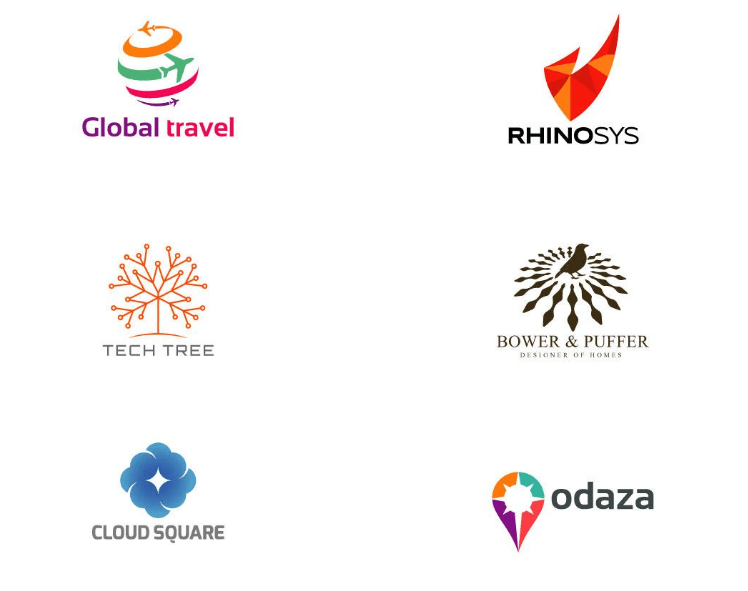
Logos are one of the most memorable elements for communicating who you are, what you sell, and the value you offer at a glance.
Designing a business logo and adding it to your flyer sets you apart from competitors and makes your brand easily recognizable; plus, it adds credibility to your business.
5. Add Graphics To The Mix
Graphics combine visual elements like artwork, drawings, charts, and symbols.
When designing a flyer, arrange these elements to get visual balance. Apply the seven principles of design, including white space, contrast, movement, and repetition, to achieve proportion, balance, and more in your flyer.
6. Get Creative With Illustrations
If you’re looking to present abstract or lifelike ideas without photos, use illustrations.
Trendy illustration styles tell a story, simplifying even the most elaborate concepts into fun, remarkable visuals.
7. Hold On To Shapes
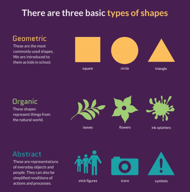
Like colors, there’s a psychology behind shapes in design. For instance, geometric shapes represent ideas, feelings, and structure; organic ones depict elements from nature, while abstract shapes signify actions and processes.
To make the best use of shapes in your flyers, be sure to understand their meanings and creative ways to apply them in your flyer designs.
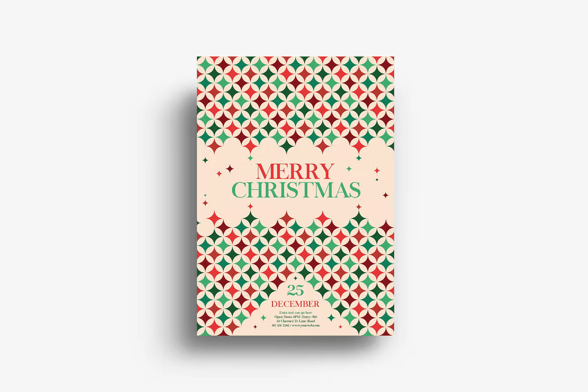
8. Establish A Pattern
Create patterns to ensure consistency and a sense of structure in your flyers. A pattern refers to the repetition of multiple elements in the same order throughout your flyer design.
This repetition allows you to introduce a visual flow into your flyers, giving viewers an idea of what elements to expect in various sections.
9. Try Shading
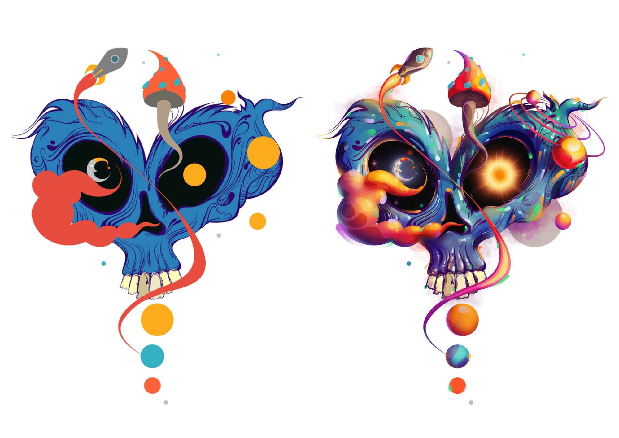
To create stunning flyer illustrations that are equally realistic, go all-in on shading.
Shading creates a photorealistic effect in your drawings by altering light angles, adding depth to 3D objects, and other similar changes. Check out this video to learn about basic shading techniques.
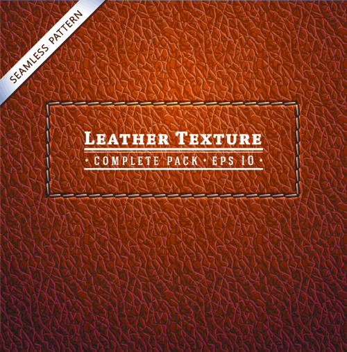
10. Keep It Real With Textures
Adding texture to your design is a powerful technique for highlighting sensory attributes of your product, service, or idea in a flyer. Is it smooth, furry, coarse, or silky?
The goal is to replicate a lifelike feel and touch to create an immersive flyer that stirs emotional responses and visual interest.
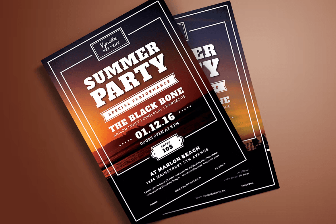
11. Pay Attention To Typography
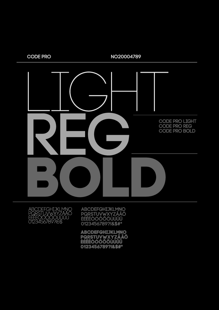
Typography refers to text appearance, including the arrangement of each font type, spacing, and size.
Ideally, use fonts that are readable, relevant, and well-arranged, with the most critical items appearing larger and bolder than others. Some of the best fonts for flyer designs include Cheddar Gothic Font Family, Sea Horse Typeface, Breymont Font, and Asthenia Font.
12. Emphasize Text Styling
With so many visual elements in a flyer, how do you draw attention to important messages if not through styling?
Text styling allows you to establish a hierarchy and emphasize specific sections using font colors, sizes, or formats like bold and italics. This 99Designs’ text layout post breaks down the best techniques to use.
13. Create Flat Geometric Designs
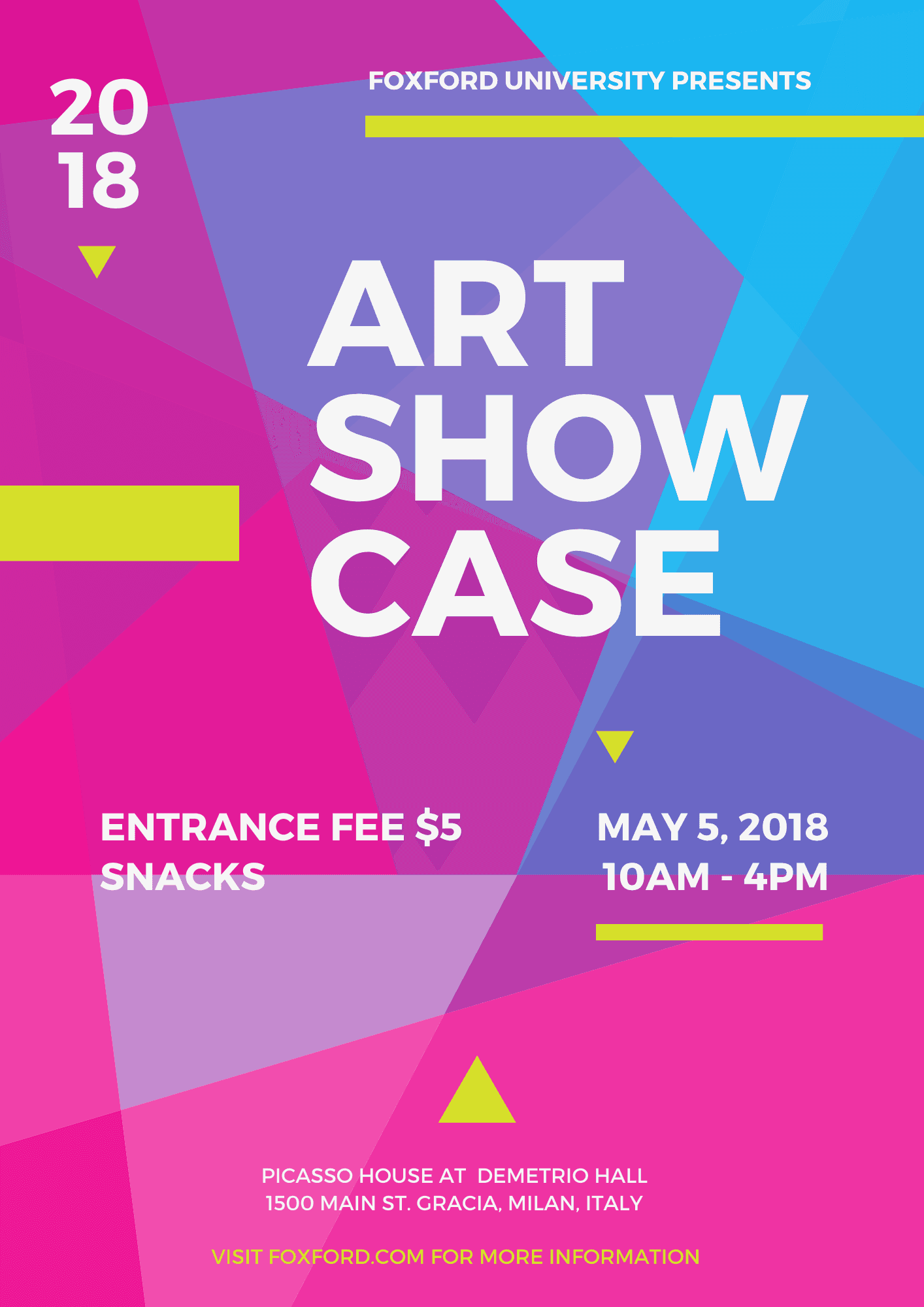
Flat geometric designs combine text, lines, and basic shapes like triangles, squares, circles, and rectangles to create beautiful minimalistic flyers.
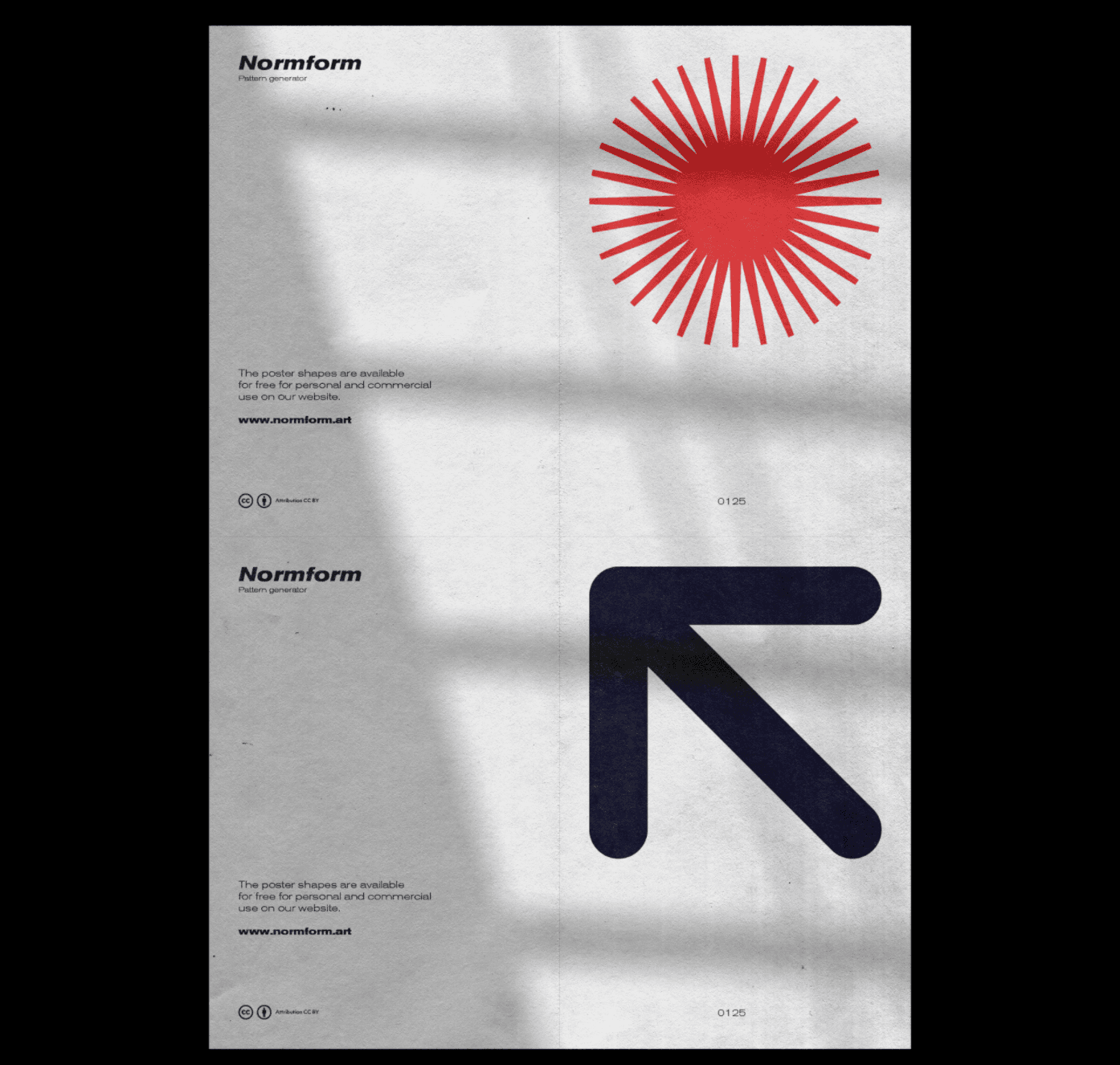
Flat geometric designs are simple, straight-to-the-point, and readable, making them ideal for marketing campaigns where you need to communicate a message quickly. Renderforest offers an in-depth post covering simple geometric design tips and tricks.
14. Go Bold With Brutalist Typography
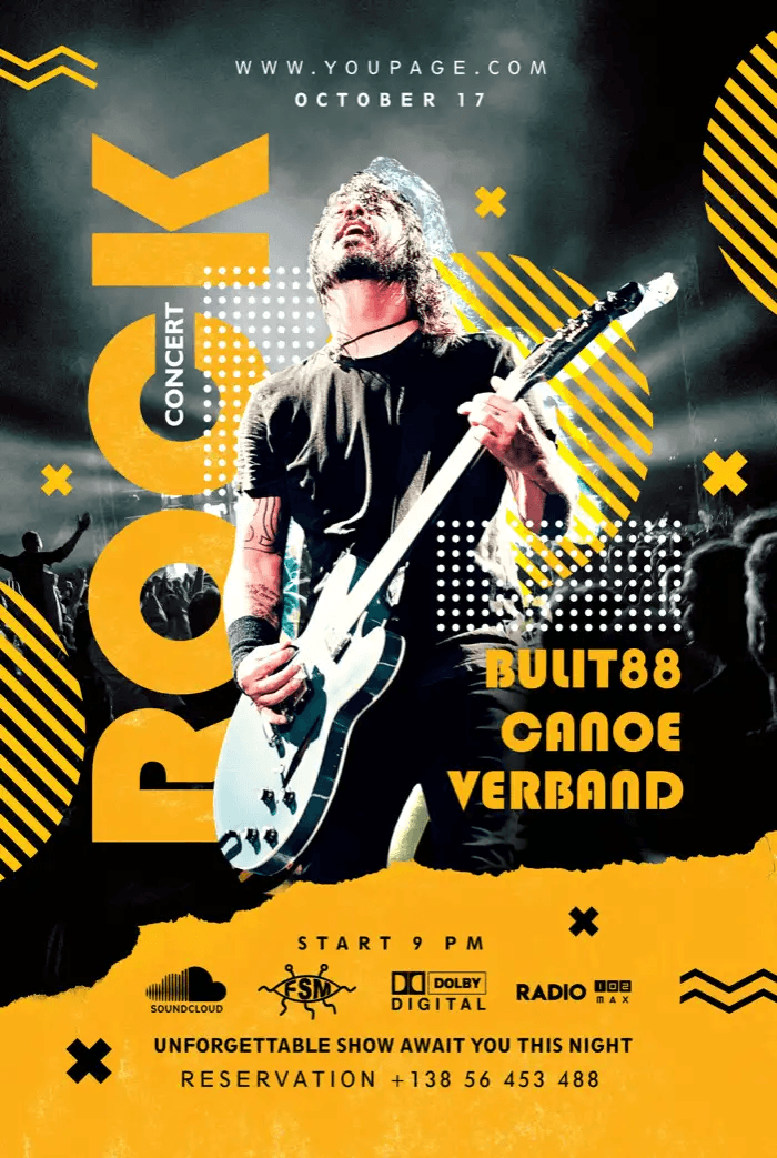
Unlike flat geometric designs, brutalist typography flyers stand out in stark contrast by featuring non-traditional fonts and clashing colors.
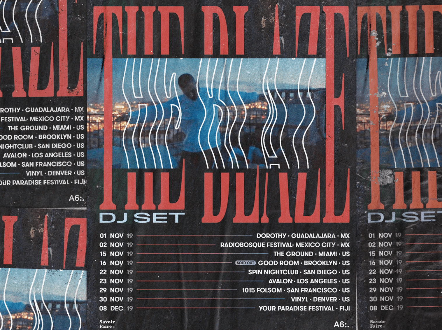
Its rawness makes it a top choice for flyers that grab attention, especially for concerts, energy drink brands, sports-related products, and more.
If you’re looking to try this daring design, some incredible brutalist fonts to use are free Miratrix, Norilsk, Single Fighter, Brokelyn, Eternal, free Konstant Grotesk, and more.
15. Be Unique With Collages
Looking to set your brand apart from thousands of other similar-looking flyers out there? Then create one-of-a-kind designs by layering virtual images or text materials from different sources to form digital collage flyers.
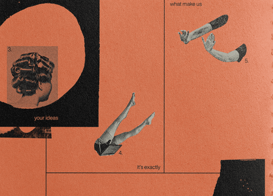
Because of the unique experience that a collage flyer delivers, they could serve as viable marketing assets for your email newsletters, e-cards, and targeted ads.
16. Stay Memorable With Photography Flyers
As mentioned earlier, images in your flyers can help you make and retain an impression on your audience within 13 milliseconds.
This gives you a chance to showcase your new or best-selling products like this one from Nike.
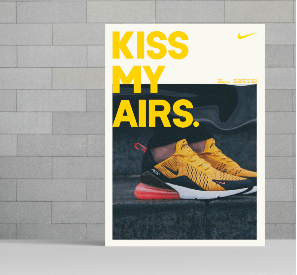
There are many more photography flyer ideas out there. Just make sure that your photography flyer design has a great headline, a clear goal, and an obvious message.
17. Create 90s Nostalgia For The Good Ol’ Days
As the name implies, this flyer taps into the 90s era to create designs that evoke fond memories. Note that the success of this design may depend on your marketing strategy—particularly your target audience—who in this case should be millennials.
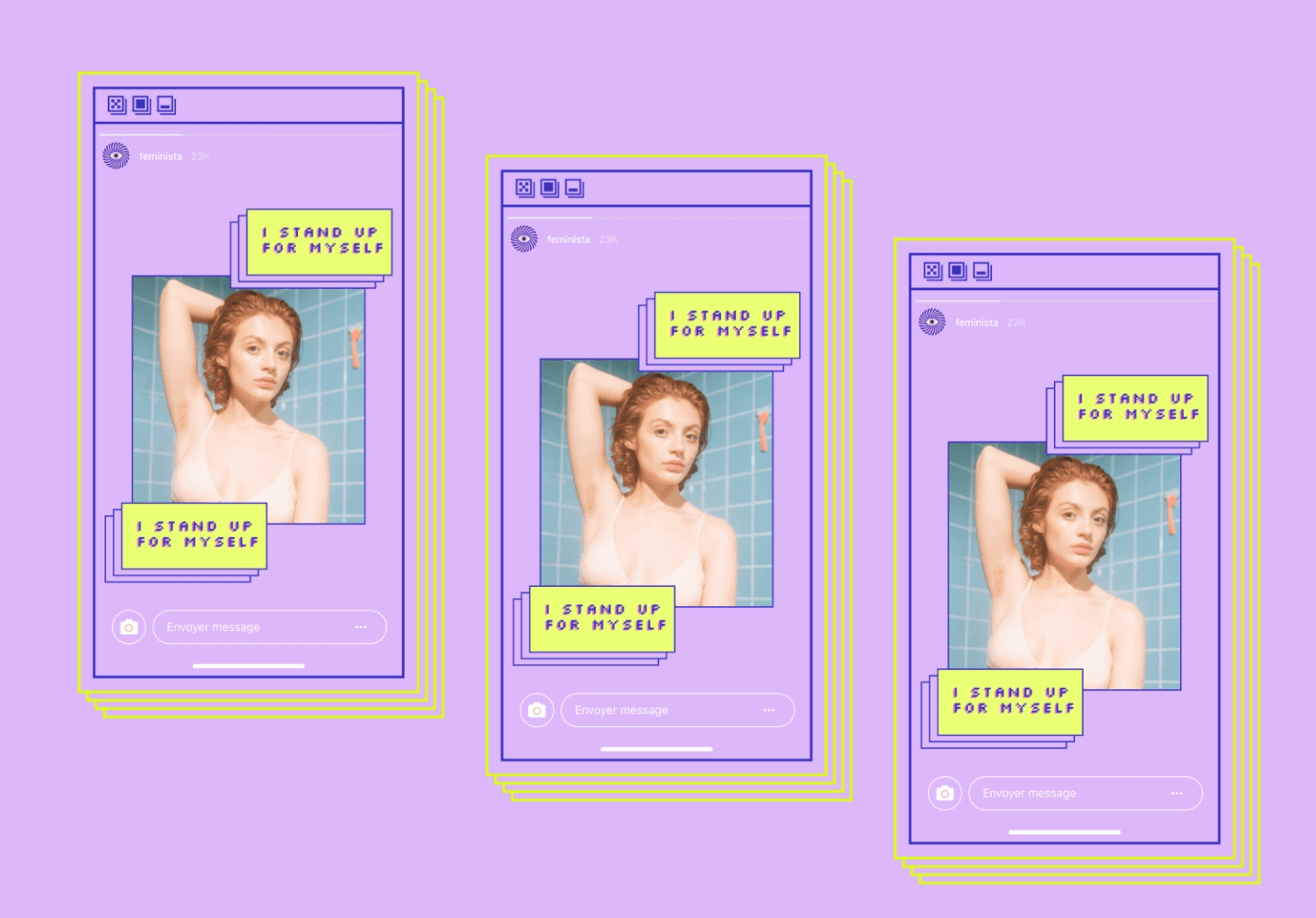
To stir up positive memories, use pictures of popular figures, technology, illustrations, or these trendy design elements from the 90s in your flyer.
18. Roughen It Up With Textured Gradient
Gradients involve the gradual blending of one vibrant color into others to create new color combinations and a unique look.
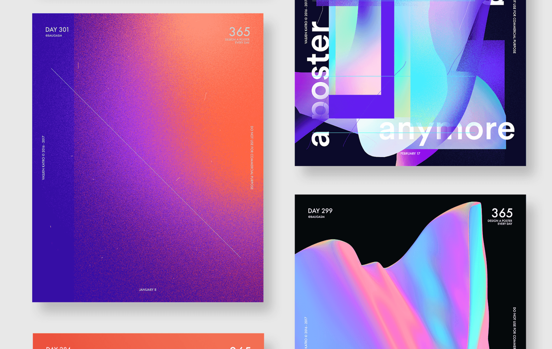
To deliver the right effect, ensure that your selections align with your audience and intended emotional response. For example, bold gradients and textures would work well for extreme sports lovers, while a calmer choice would apply for more conservative business people.
Here’s a snappy design tutorial on creating a textured gradient design that heightens visual interest in your flyer.
19. Try Typographic Clipping Mask Flyers
Infuse personality in your flyer texts and direct focus on them by using a typographic clipping mask. It allows you to display images, patterns, and other visual elements within the shape of your fonts like in the flyer below.
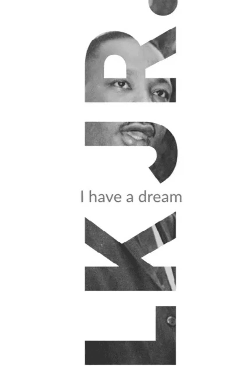
There are tons of resources to walk you through how to create text masks on InDesign, Canva, and Photoshop, among others.
20. Dig Deep With Double Exposure Effect
Creating a double exposure involves combining two exposures into one image. In flyers, this effect creates an incredible evocative result that conveys deep meaning or symbolism.
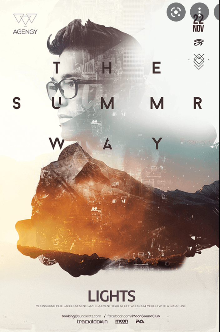
This makes it a powerful flyer design choice for artistic projects like book releases, art exhibitions, and movie premiers.
21. Splash Some Watercolor
Nothing depicts positivity and creativity like the burst of colors in a watercolor flyer.
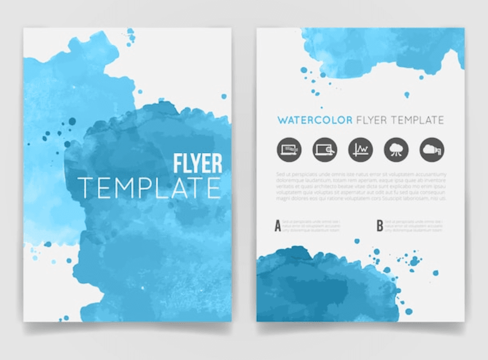
That’s why it’s worth trying if you’re creating flyers for an art show, festivals (e.g., Holi), children’s products, or personal events like birthdays or weddings. Check out examples of watercolor flyers and how to use this timeless classic.
22. Stay Simple With Flowcharts
For businesses with complex services, products, or processes, flowchart designs are a great way to break down essential steps from start to finish. They are digestible and visually stimulating, allowing you to liven up an otherwise boring idea.
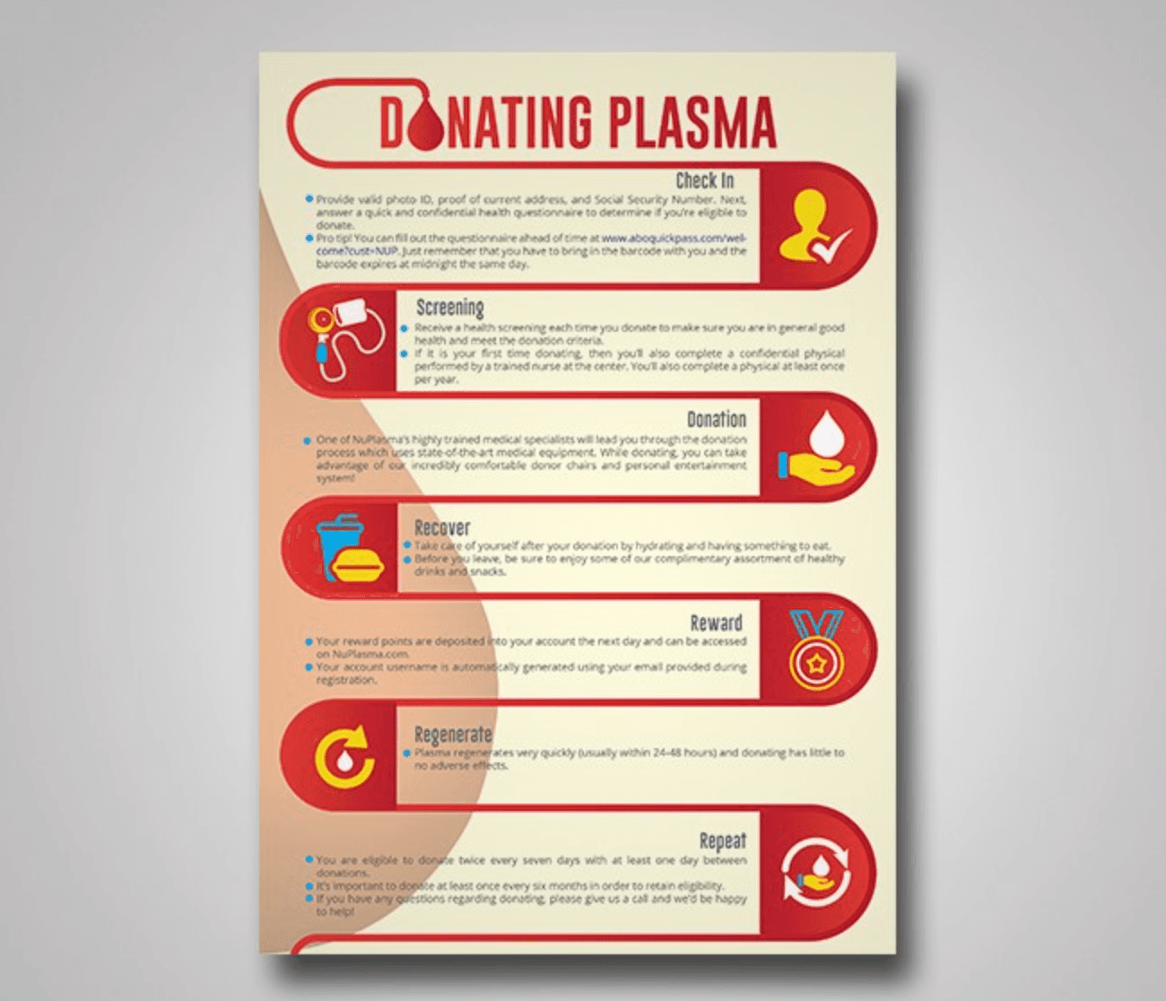
Depending on your existing marketing content types, you can also repurpose ebooks, articles, or podcasts into flowchart flyers.
23. Create Old School Diner Inspired Images
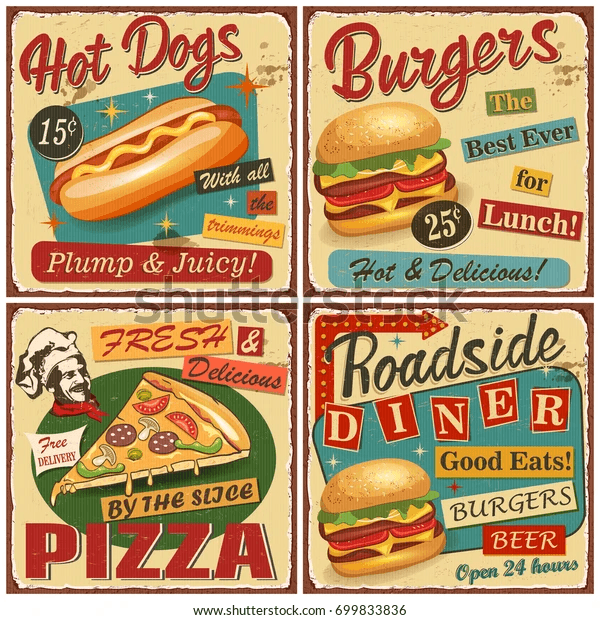
Much like its name, this flyer theme taps into old-fashioned designs to stir up memories associated with food, drinks, and diners from an earlier era.
The most common use of this theme is for showcasing well-loved traditional recipes. Check out these examples of old-school diner flyer ideas for inspiration.
24. Explore Outer Space
Create an immersive experience and stimulate minds with vibrant outer space themes.
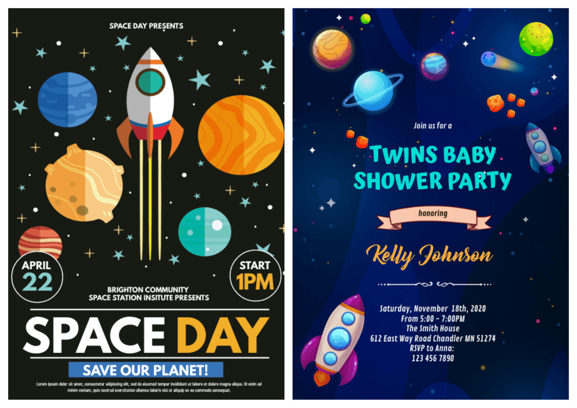
Source Left Flyer, Source Right Flyer
You’ll likely find this theme in flyers for science, kids’ birthdays, themed events, and educational materials. Creative Market lays out noteworthy design trends for outer space..
25. Explore The Wilderness Flyer Theme
Wilderness theme flyers are exactly what they sound like—designs that display uninhabited stretches of land with nature-inspired colors and graphics.
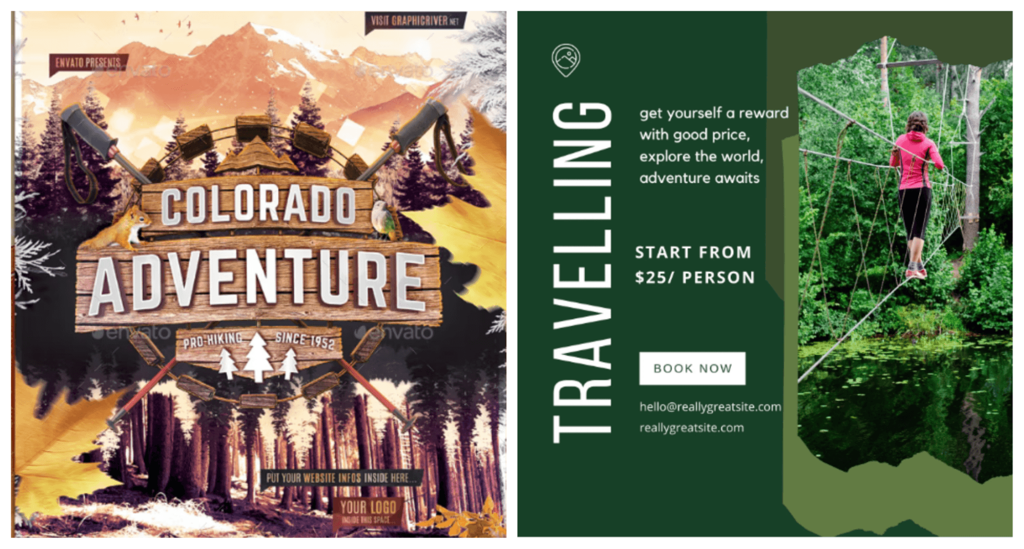
Source Left Flyer, Source Right Flyer
These flyer designs are suited to brands that offer expeditions, survival courses, mountaineering, hiking, camping, and other adventurous activities. If you offer these services, see Canva’s 300+ wilderness-themed flyers designs to use in your marketing.
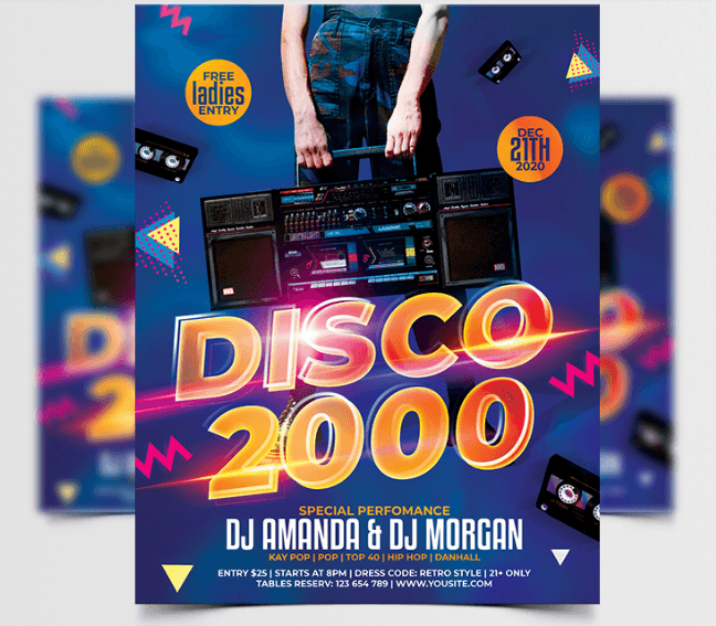
26. Use Concert Flyers
As the idea is to attract a large audience to your show, concert-themed flyers usually feature elements that draw visual interest, such as lights, vivid colors, artists, and silhouettes.
While you can experiment with elements, it’s important to choose templates that match your band’s style to pull in the right audience when designing your concert flyers.
Here’s a quick video tutorial to create your own concert flyer design.
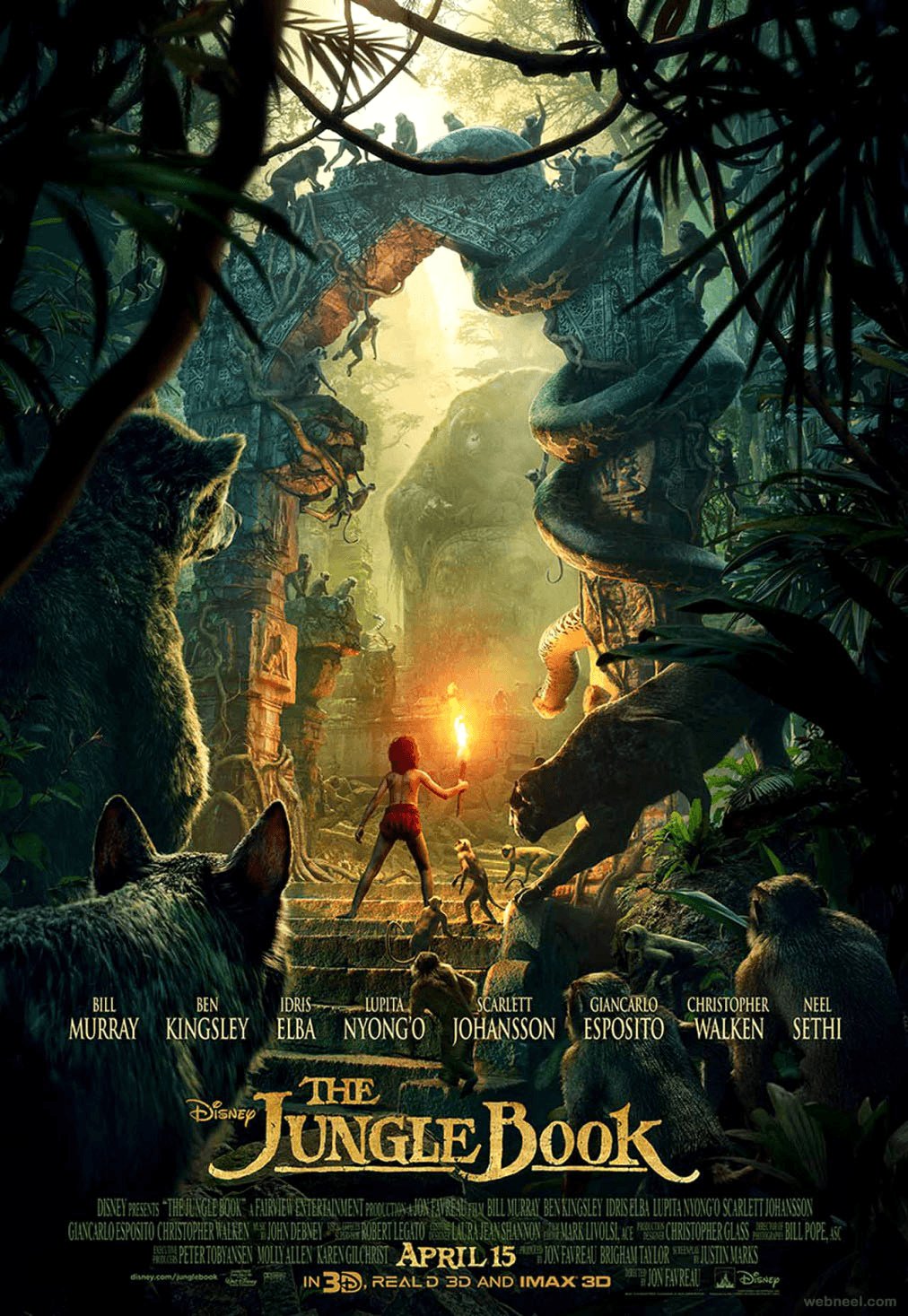
27. Make A Movie Flyer
From cover designs to film release announcements, movie flyers aim to condense the storyline into a static image like in this Jungle Book flyer.
To achieve this, these flyers will usually display bold typography, visually impactful images or graphics, and eye-catching colors.
Tutsplus walks through the basics of creating a movie poster or flyer for different genres.
28. Go Retro
Retro designs draw inspiration from influences in historical eras and present them in a modern style. These flyers spark positive memories from the past while still appealing to current design trends.
Check out retro design elements to add to your flyers and learn how to create yours.
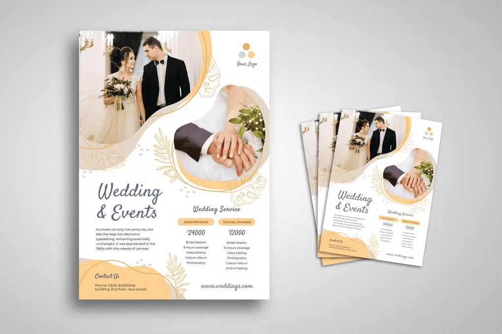
29. Loving Wedding Flyer
Rich colors, elegant fonts, powerful imagery, and a clean look are common elements in a wedding flyer.
While there’s no limit to creativity in a wedding flyer, it should convey a message of a new beginning, hope, and happiness. Whether you choose a traditional design or a stylish one, arm yourself with the design tips you need for creating amazing wedding flyers.
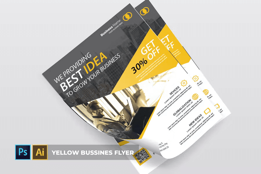
30. Make It Corporate
Corporate flyers are mainly used to promote or educate employees about internal processes. They rely on high-quality visuals, legible fonts, and brand colors to deliver professional designs.
See these 25 professional corporate flyer templates for inspiration.
31. Design For Video games
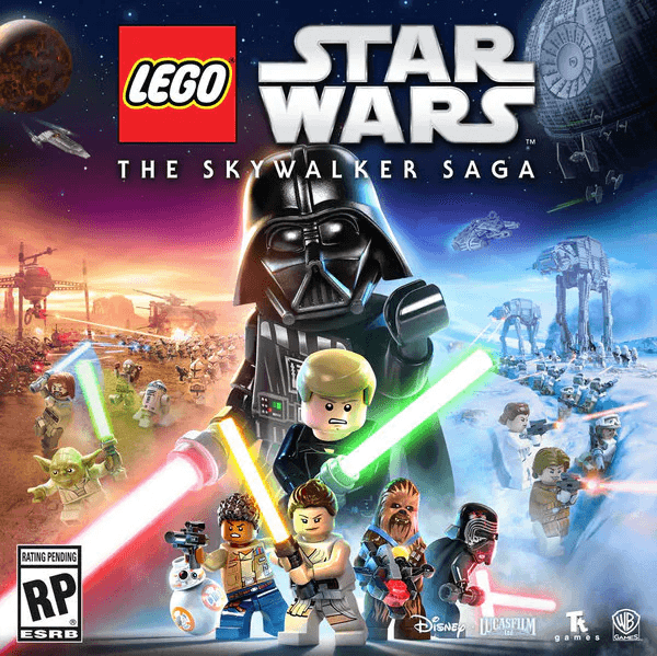
Like in movie flyers, video game flyer elements should signal what to expect. For example, at a glance, the lively visuals, bright colors, and style in this Star Wars flyer all point to action-based content.
Here is a step-by-step guide on how to create graphic designs for video games.

